Hey there! I made this page to document my time at FareHarbor, up until I parted ways in 2021. I don’t have any special info about what FH is up to these days, and I’d guess a lot of this is out of date now. Ok cool bye!
FareHarbor Scrapbook
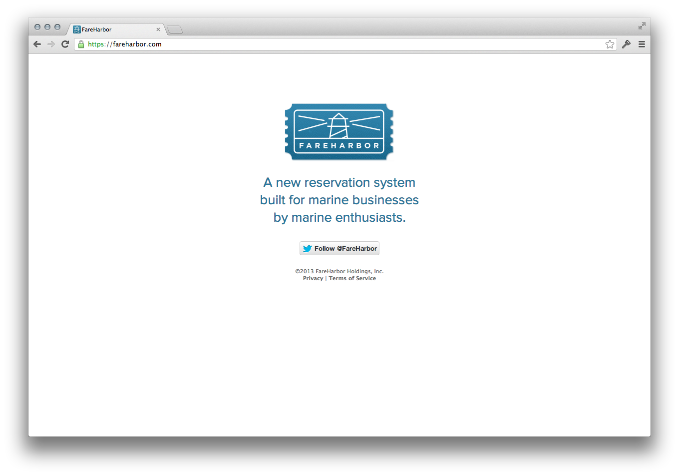
In 2013, I co-founded FareHarbor, an online reservation system for tour and activity providers. I worked as Head of Product until mid-2021, when I shifted to an advisory role. We started FareHarbor with a single client, and six years later it was the most used software of its kind worldwide.
FareHarbor has been used by over 15,000 activity and attraction companies, from mom-and-pop kayak and boat tours to Citi Bike NYC and the United Nations.
In 2018, we joined Booking.com.
FareHarbor gave me so many experiences: my first trip out of the US, adventures with our clients, watching a company grow from 5 to 500+, and inventing and iterating on hundreds of features.
Getting to make FareHarbor was one of the great joys of my life. As the founding designer I got to be extremely particular, and designed or led every feature we built. For years, I wrote every line of our CSS. It was a busy time.
Software is fleeting, especially on the web. Sometimes I'm envious of designers of “real” things – a can opener or a bridge doesn't get quietly wiped away with an update, even if that update is for the better.
So this page is my effort to give a little more permanence to more than eight years of work and memories. I can be a bit of a digital hoarder, which gave me a lot to work with when I was digging through folders of screenshots and photos.
Early days
Although obvious now, who FareHarbor would be for was less clear at the beginning. We started off more boat-focused, and had a lot of conversations around things like how schedules should be structured and the kinds of business relationships companies in the activity industry have with each other.
Switching to FareHarbor was the first time many of our customers used any kind of software for their reservation management. It’s harder to move someone from a binder of bookings to a computer than it might seem. In the anything-goes data model of paper, you can just scribble in the margins if you want to give a deal or adjust your schedule. Databases are a lot less forgiving.
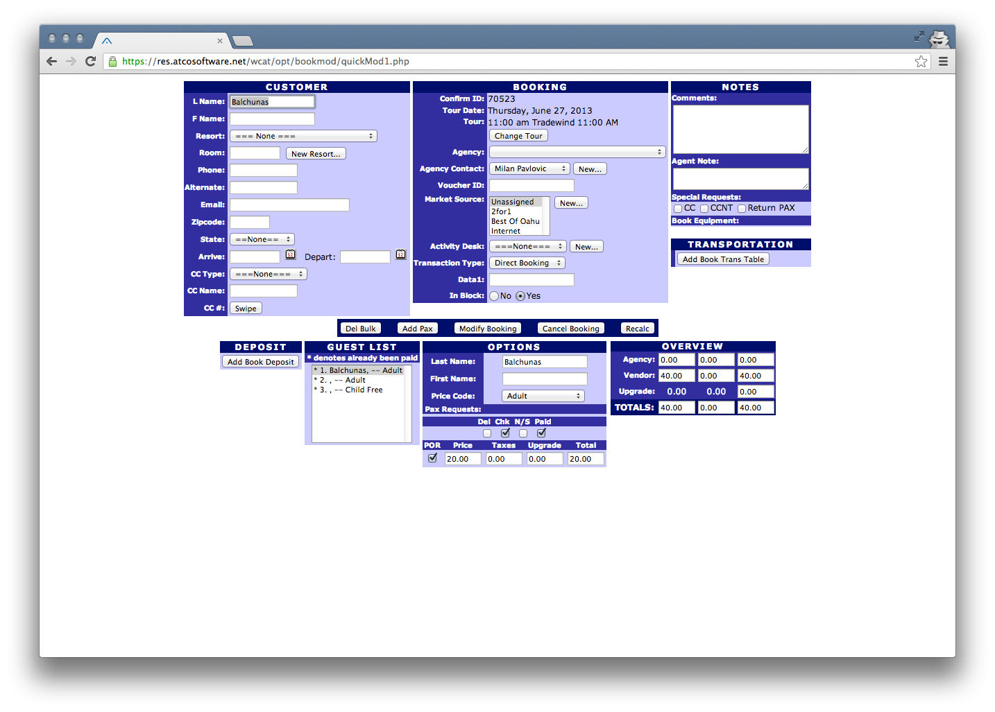
For companies who were using software, most of what we were replacing was pretty archaic in terms of UI, though the systems were developed by teams with decades of industry experience.
The first version came together remarkably quickly, going live for North Shore Catamaran and taking our first online booking about three months after we started. Zach, Matt, and I had worked together on a few other projects and were very effective at Django and spinning up new apps. Decisions we made then about data structures are still core to how FareHarbor works today.
We were so excited about launching that we rigged up a computer to play a five second clip of the Golden Gate Bridge's foghorn in our office whenever an online booking came in. This was an idea that our open-plan office mates were remarkably tolerant of. (And it pretty quickly became too much. Years later we would have monitoring set up to warn if the number of online bookings fell below a certain threshold per minute.)
Talking to users
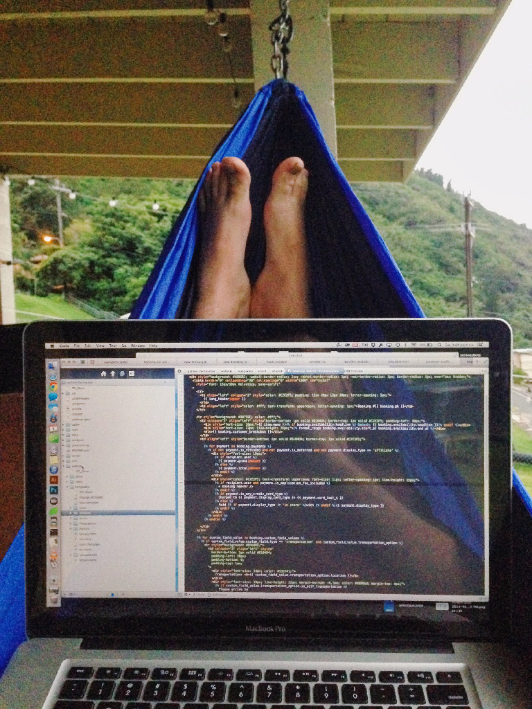
One of the best things we did was talk to real customers from the start. The b2b sales process makes it hard to avoid, really. My previous startup projects involved a lot of sitting at a whiteboard and dreaming up new features, so it was refreshing to have a potential customer say “I’d use your software if it had this feature, and here’s how I want it to work.”
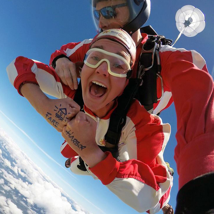
These conversations shaped the way I saw our users. Many of them didn’t get into what they do to run a business. They had a passion – for sailing, for an extreme sport, for showing people their city – and discovered it was something they could do every day and make money from.
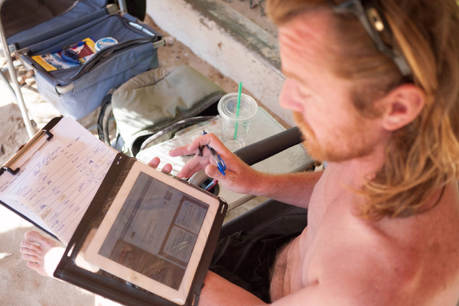
Those in-person experiences gave me empathy for our users in a way that I think is often undervalued in business software.
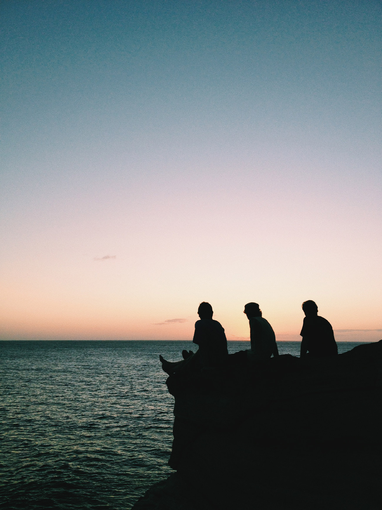
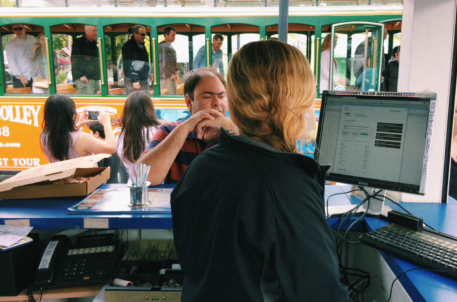
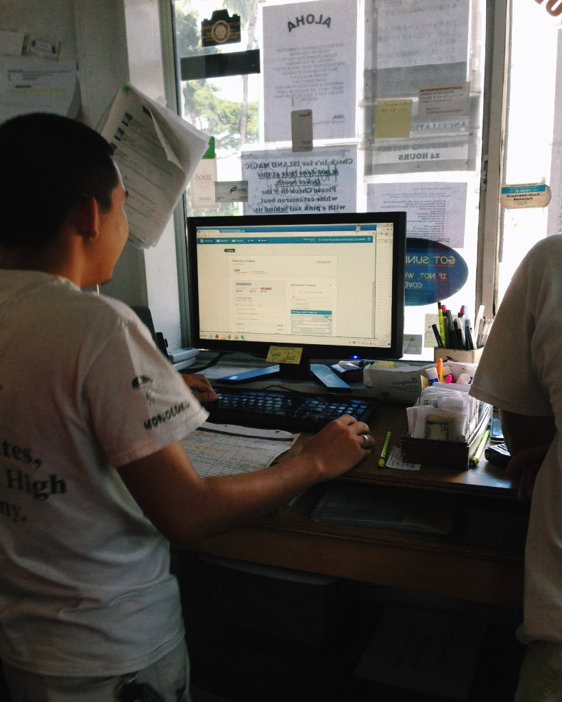
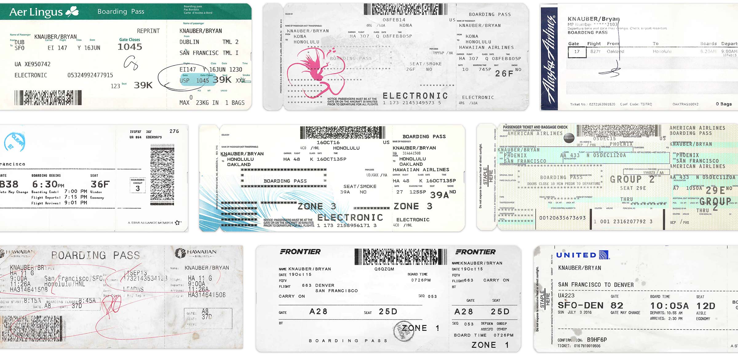
The day we spent in the reservation booth for a parasail company in Hawaii is a bit of a company folk tale. Four of us, plus the usual staff, all crammed into a room with a ringing phone and a line of eager tourists waiting to get checked in. I had a lot of the fundamentals right, but anything in our UI that made the staff wait or scroll was getting in the way. If you’ve ever watched someone try to use software you made you know how stressful it can be – this turned that up to 11. (The reports of my contributions beyond taking notes are a bit overblown, I only answered the phone once.)
It was clearer than ever that FareHarbor couldn’t be the reason someone had to say, “Sorry, I know you’re upset but my system is being slow today.”
I ended up redesigning the main booking form for authenticated users after that, to load as much as we could as early as possible and make it fit on one screen. It’s a solution that wouldn’t have gotten attention on the “inspiration” sites for designers that were popular at the time, but it ended up being perfect for the use case.
Trying everything
| 1,427,657 | 1,052,204 | 375,453 | 8,297 |
| Lines added | Lines deleted | Net lines of code | Commits |
- Lines added: 1,427,657
- Lines deleted: 1,052,204
- Net lines of code: 375,453
- Commits: 8,297
git log --shortstat plus some fiddling.)
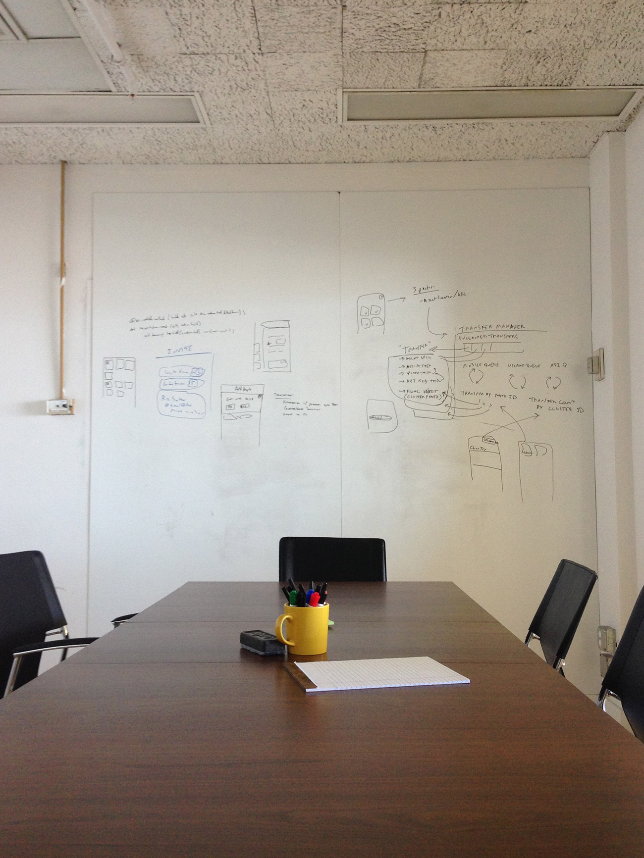
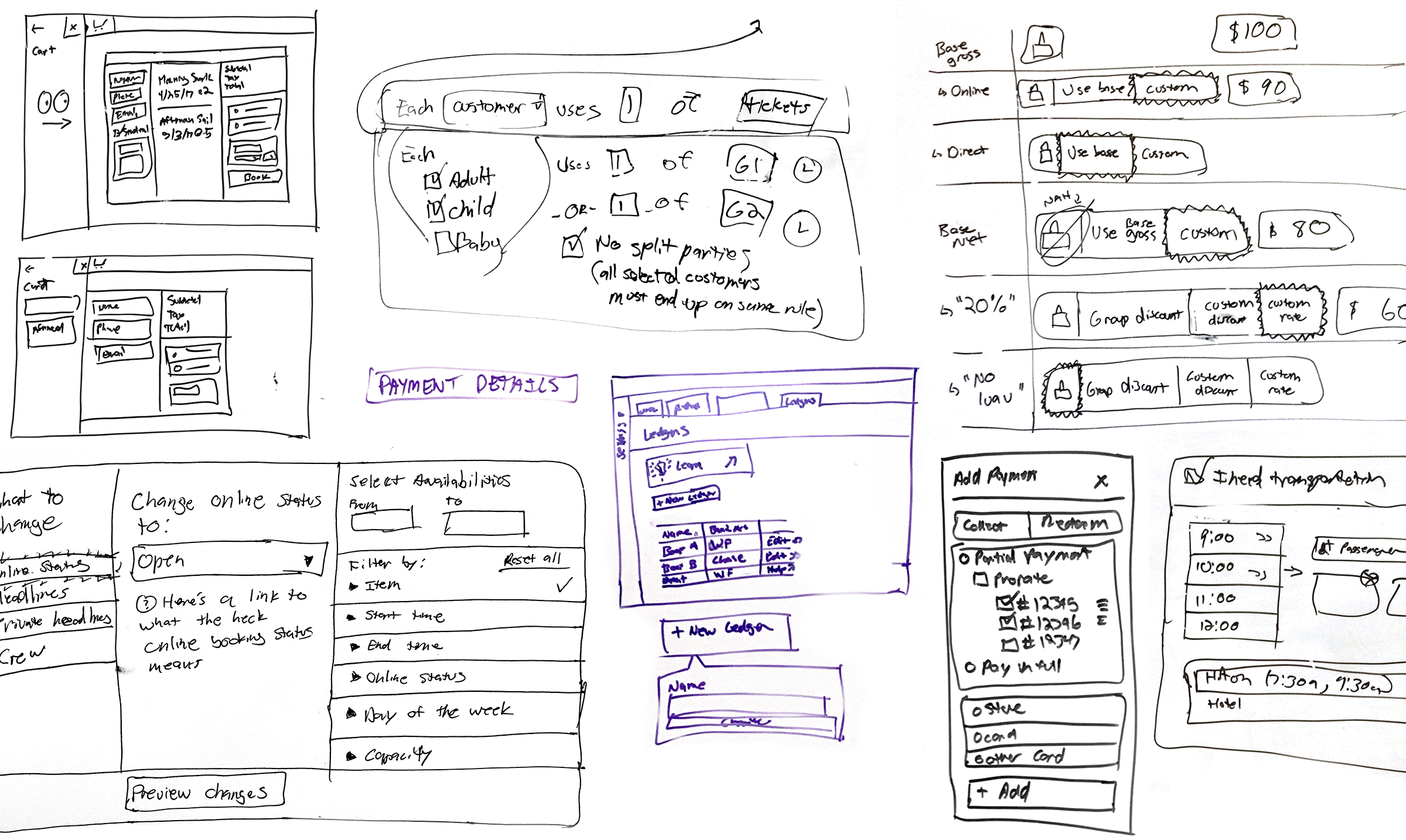
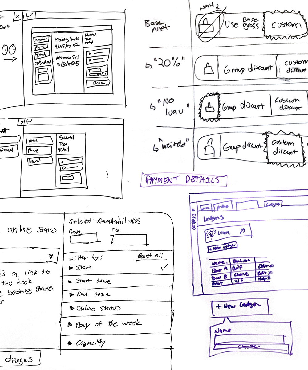
There’s a line in Citizen Kane where Kane says, “I don’t know how to run a newspaper, Mr. Thatcher, I just try everything I can think of.” It stuck with me when I first heard it because I think it captures so well what it’s like to do design for a startup.
We didn’t set out knowing how to design a reservation system, and some parts of the industry felt super overwhelming. Have you ever tried to figure out how tax should be allocated in an affiliate reverse-billing situation? The answer is “everyone does it differently.”
So I’d do a design and we'd build something, then we’d see how it worked and what feedback we got. Sometimes we’d get it pretty much right on the first try – other times, we’d be tinkering to get it just right for years.
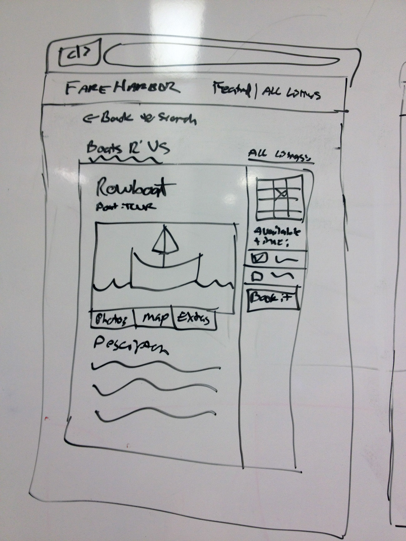
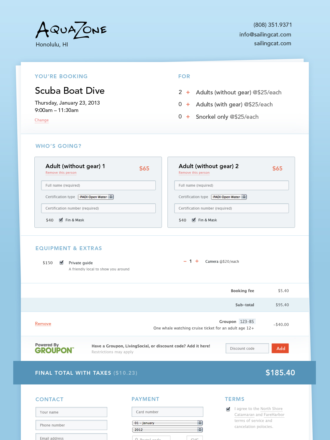
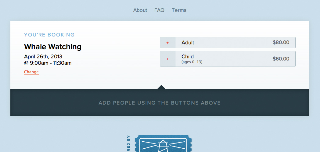
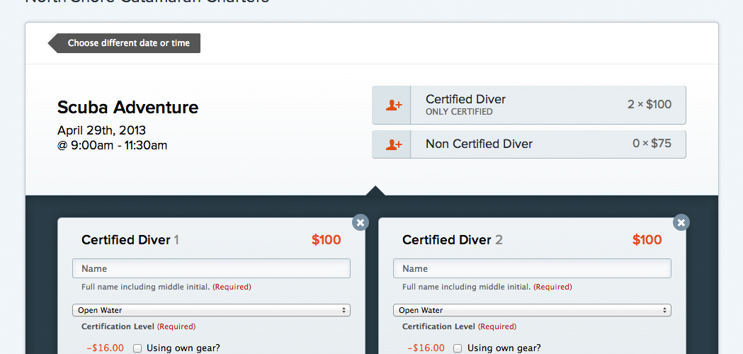
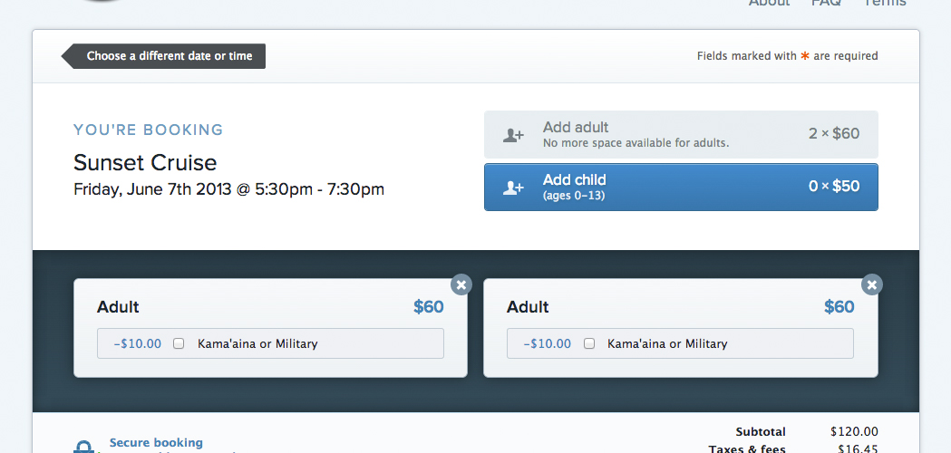
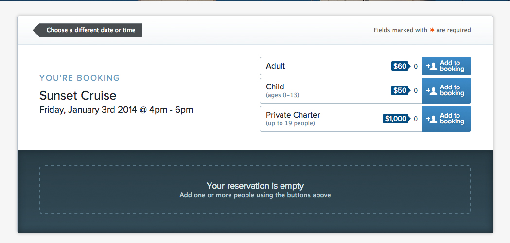
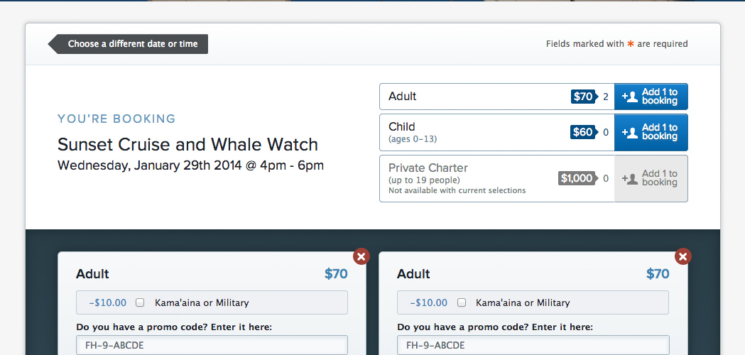
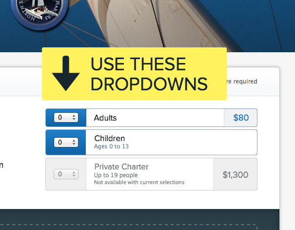
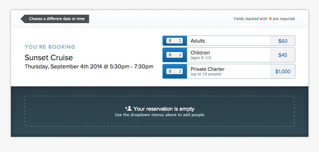
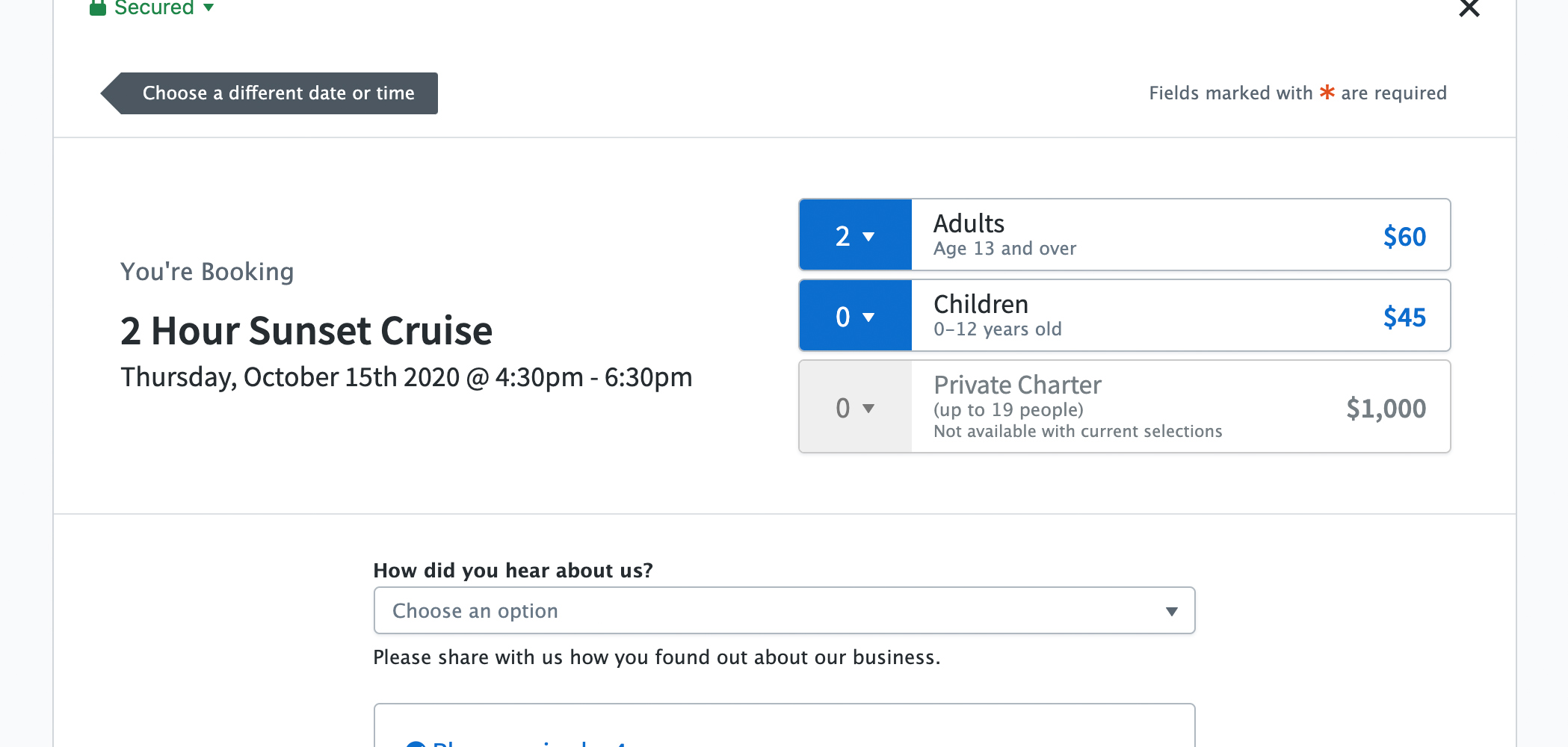
Here’s just one example of that: the UI for choosing what to add when booking online, which is maybe one of the most important functions of the whole app. (By the way, these screenshots are embarrassingly old and not even high-resolution, but they do a good job of illustrating how the design process goes.)
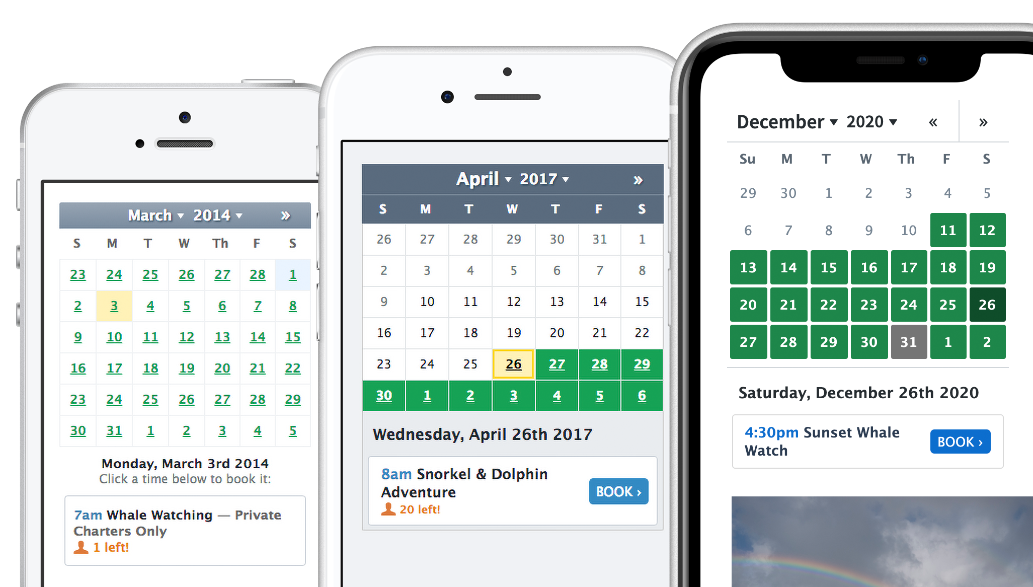
Another example: a month calendar picker. Not only is the most recent version more appealing, but thanks to an increased focus on inclusivity and Josh’s expertise, it’s also much more accessible.
Software that works
I really like making software that people use to get their work done, the kinds of interfaces they live in all day, every day. It’s an area of design some find boring, but I think it’s anything but. Especially when the end result of that work is taking people downhill mountain biking, on a boozy sunset harbor cruise, or into an escape room.
“Enterprise” is tech jargon for these kinds of applications. Like FareHarbor, they’re usually filled with forms, tables of data, and complex settings. Those things aren’t very sexy, but it’s a design opportunity to put craft and thought where there often isn’t. It’s also a big responsibility – to make software that people sometimes must use at work.
It also has to work right every time. I use the example of Instagram (which I love). If I wake up in the morning and can’t watch through my stories, I’ll be bummed, but there’s no real consequence. If I can’t log in and check in a boat of 100 passengers, it could ruin someone’s vacation – or someone’s business.
A side effect of spending a lot of time on these kinds of projects is that I am not terribly experienced with growth hacking, or designing to trick users into taking an action. I’d much rather talk about accounting system flows than which button radius converts better.

The team
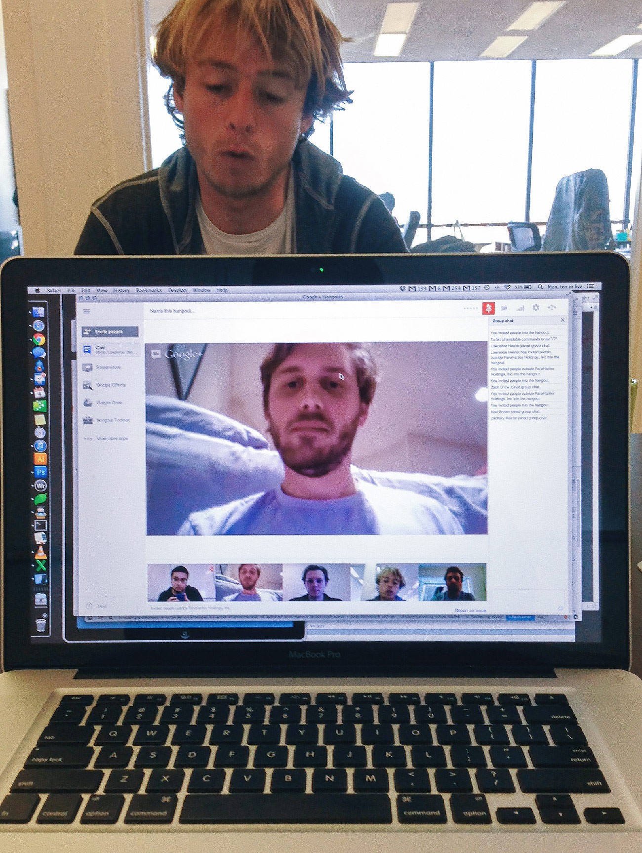
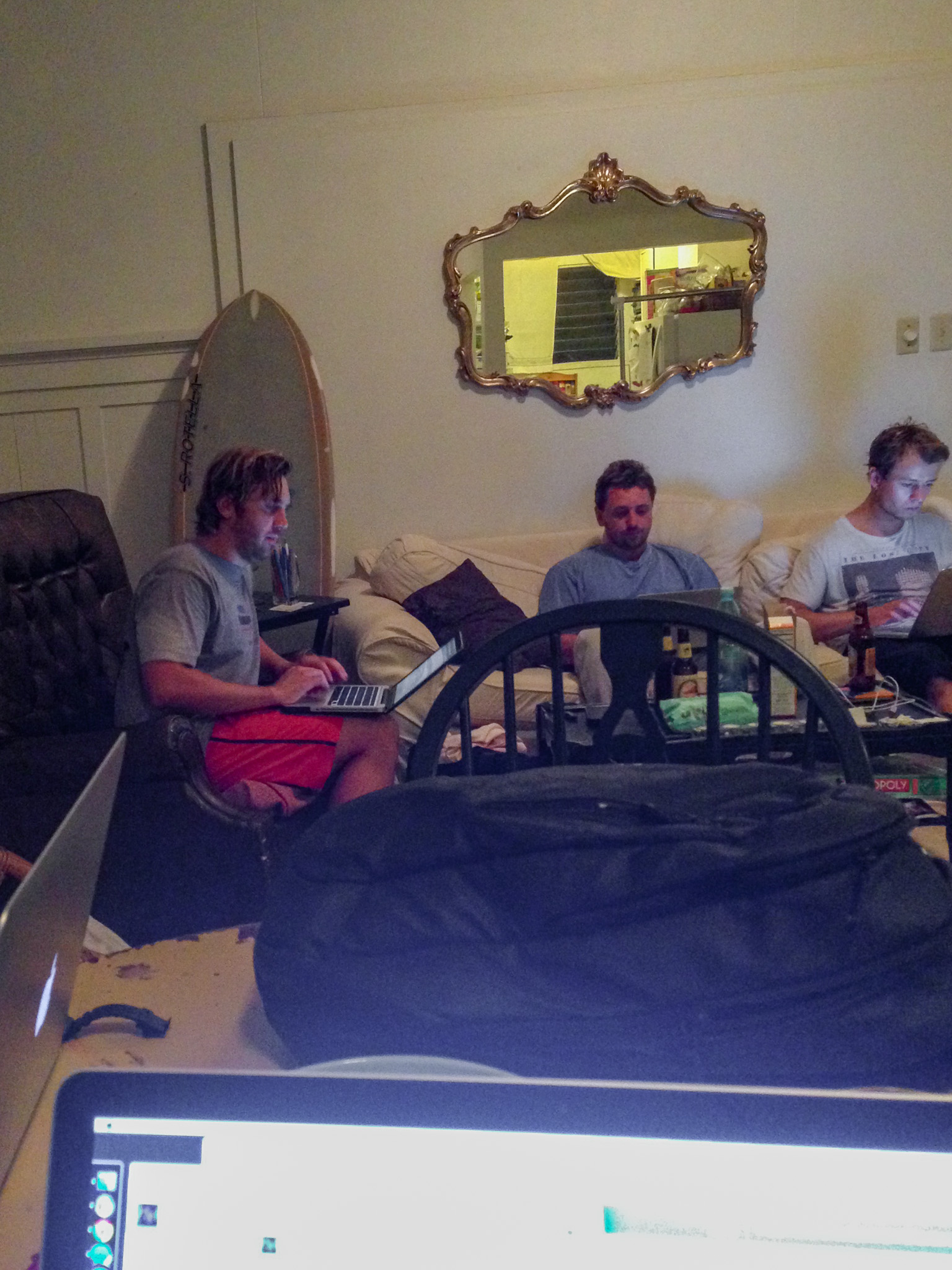
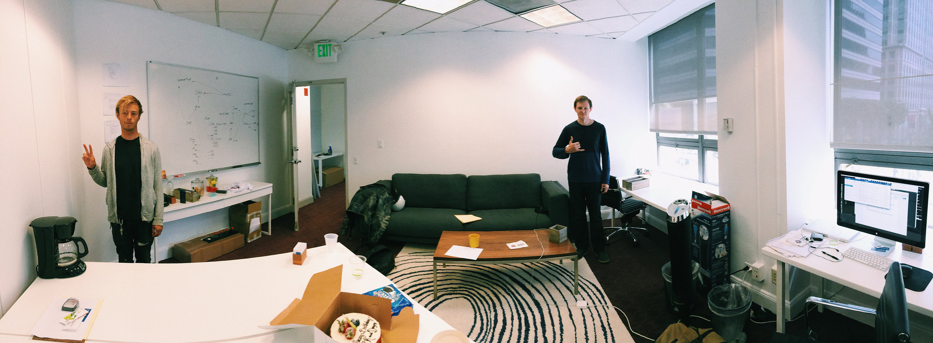
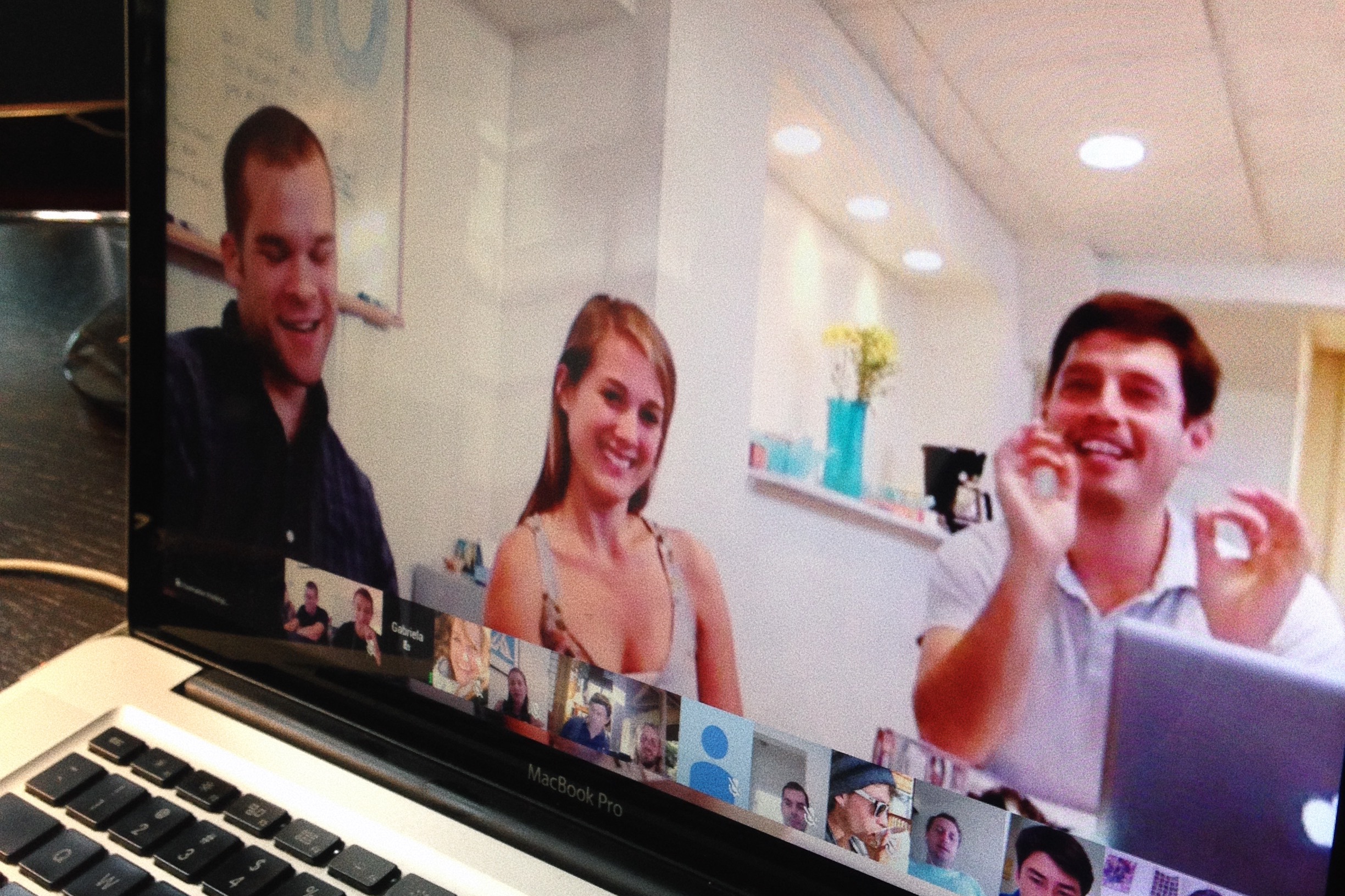
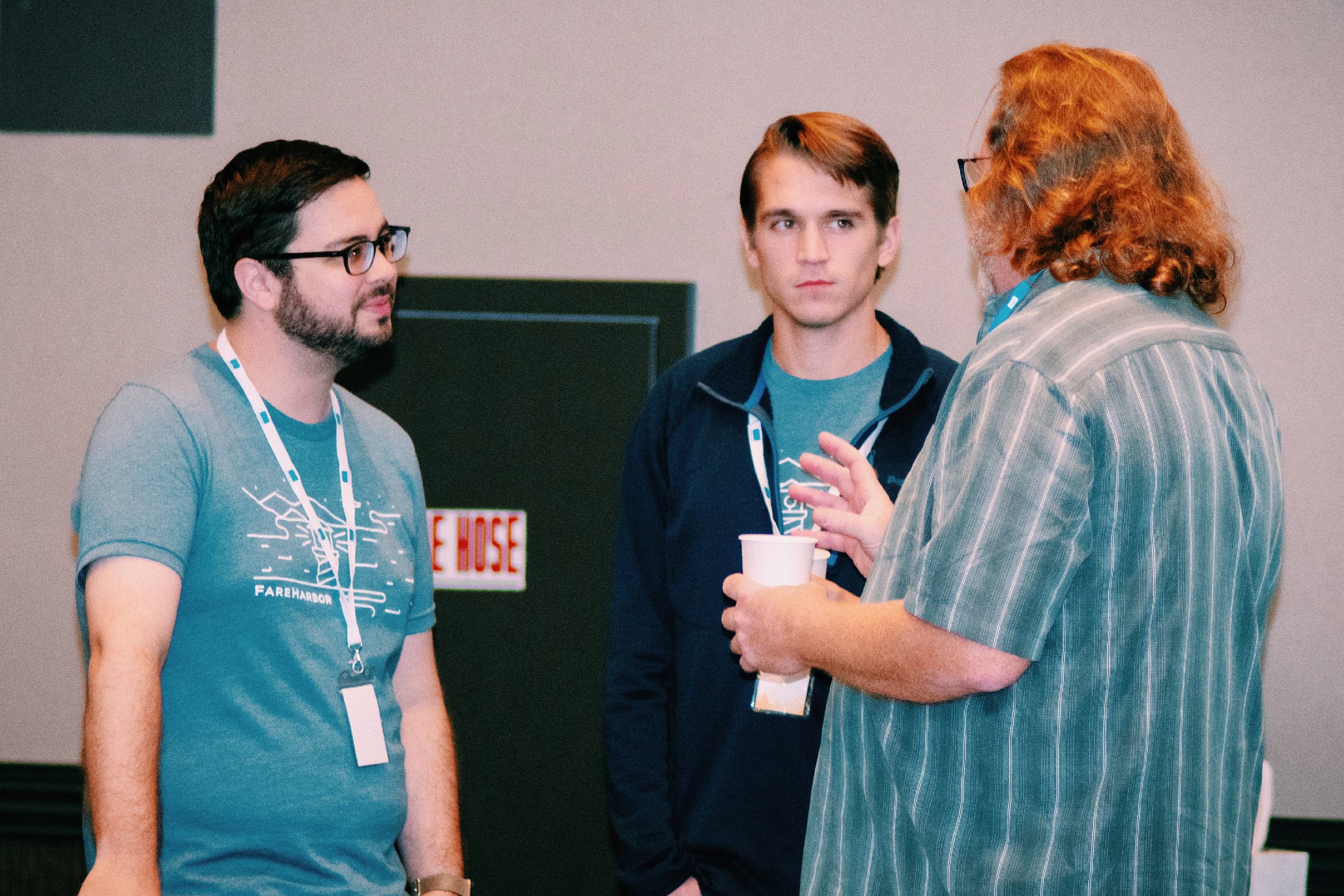
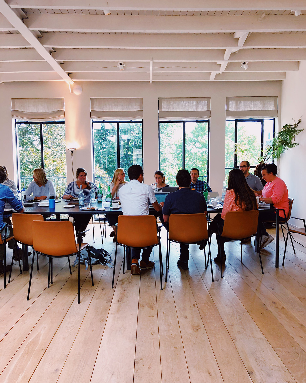
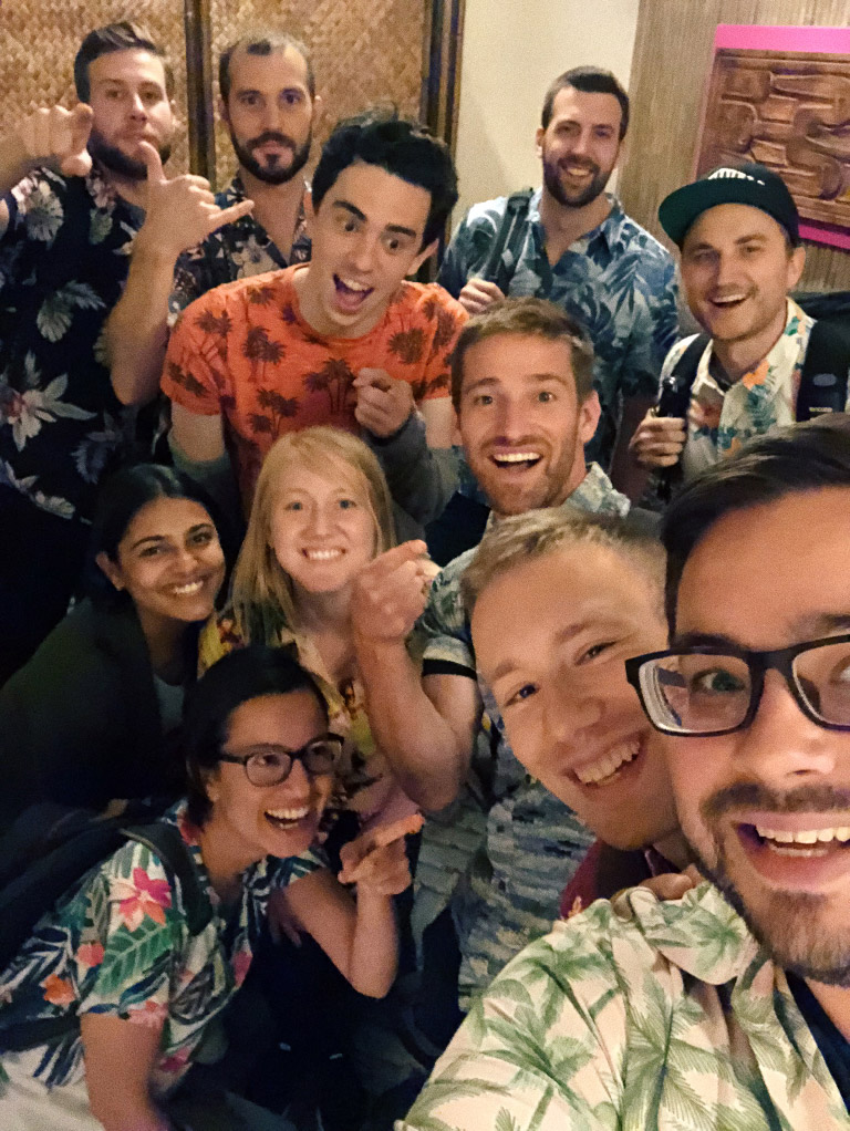
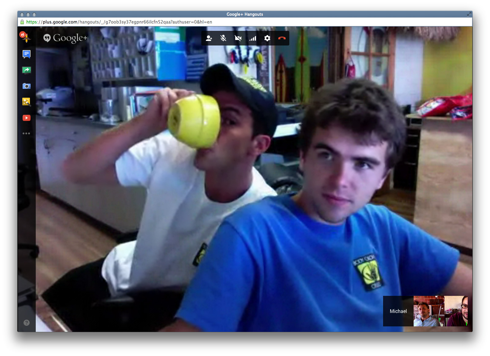
FareHarbor was distributed before it was cool. A lot of my photos of the FH crew over the years are a grid of faces on a screen. For the first year or so it was just the five of us, and then we started adding to the team. Now, over a thousand incredible people have worked at FareHarbor in offices all over the world.
Things started getting weird when I no longer knew everyone’s name. Then, I’d visit one of our offices and colleagues would know me from video calls but I wouldn’t know them. Then it got really wild when I visited our Amsterdam office and overheard conversations in other languages, with terms that Nikki and I had made up like Customer Types and Price Sheets sprinkled in.
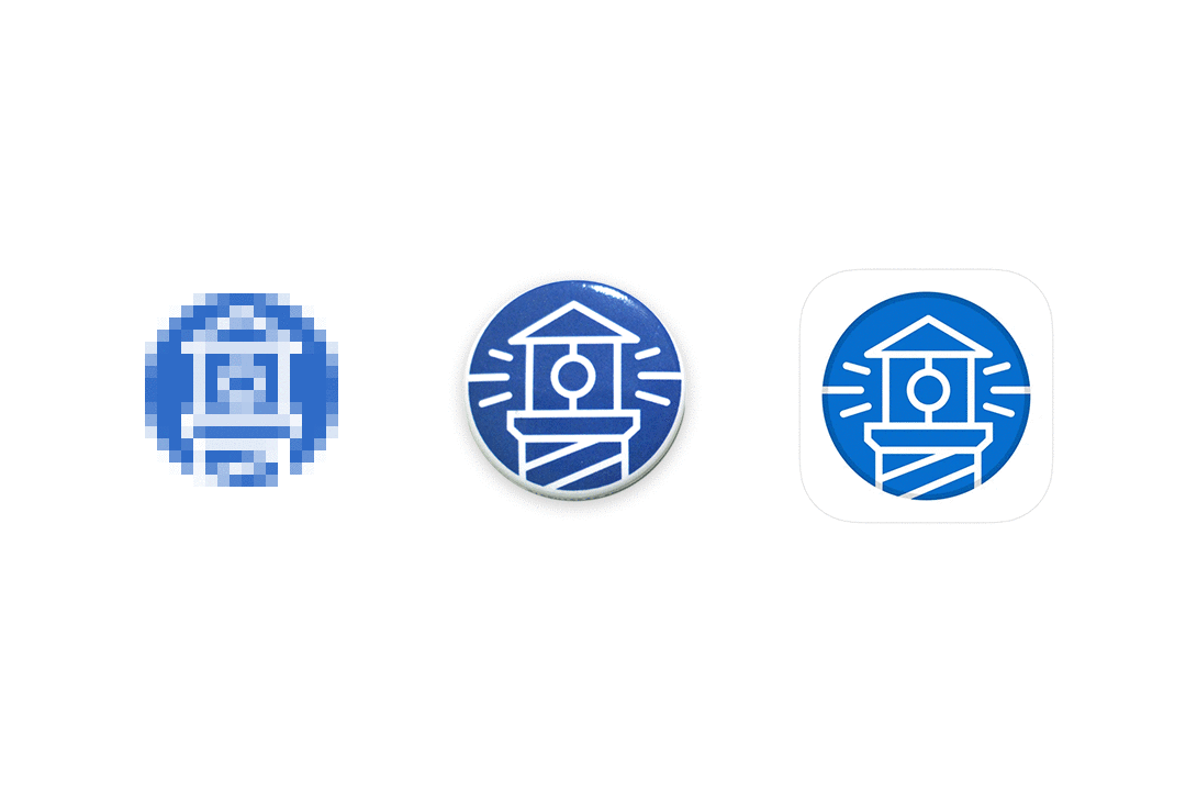
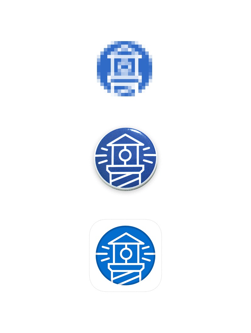
The brand
#0a6ece
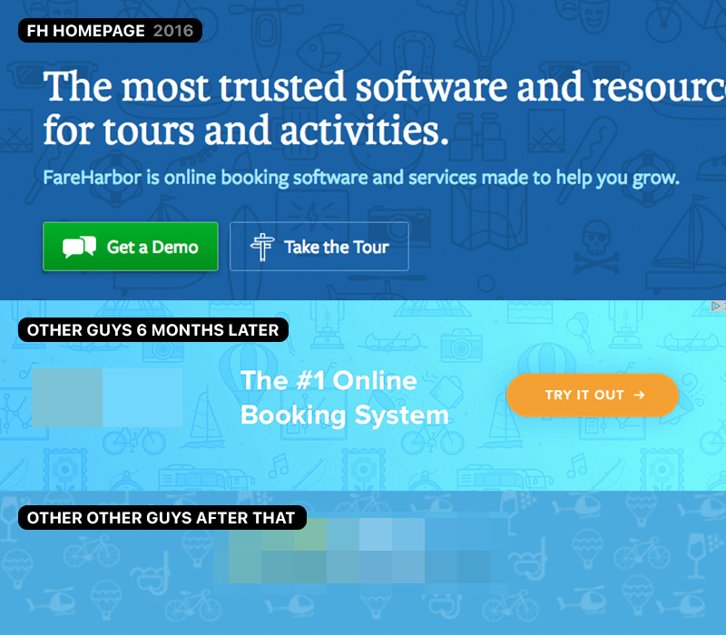
Most people interact with the white-labeled booking process, so despite a cameo in an episode of The Real Housewives of Salt Lake City, the FareHarbor name isn’t generally known. We didn’t start a formal marketing design team until about five years in, so I did most of our early branding and design work, with a little outside help.
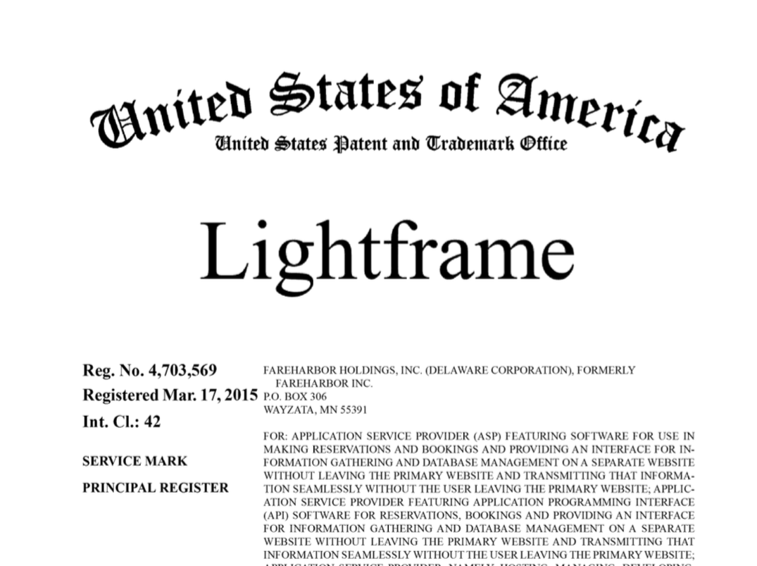
I also got to shape the language around the brand. Notably, when we were designing the booking overlay that would go on companies’ websites, some of our team would mix up “lightbox” and “iframe.” I ran with it and started calling it the Lightframe, which is now a US trademark.
The best part was what people did with it. You know you’re onto something when folks make fan art about your reservation management and accounting system.
Glamour shots
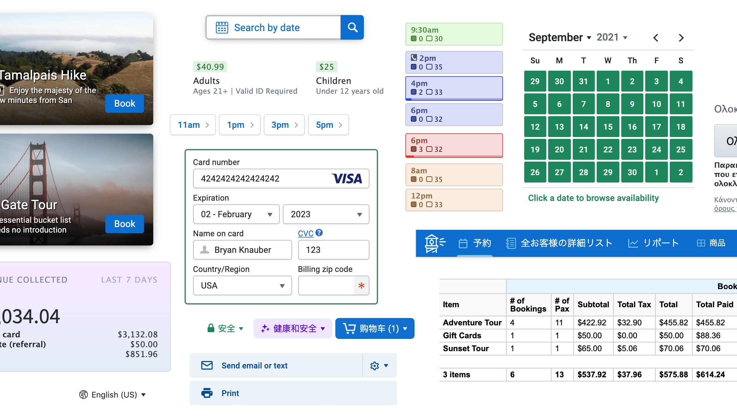
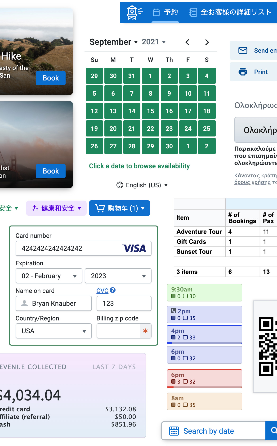
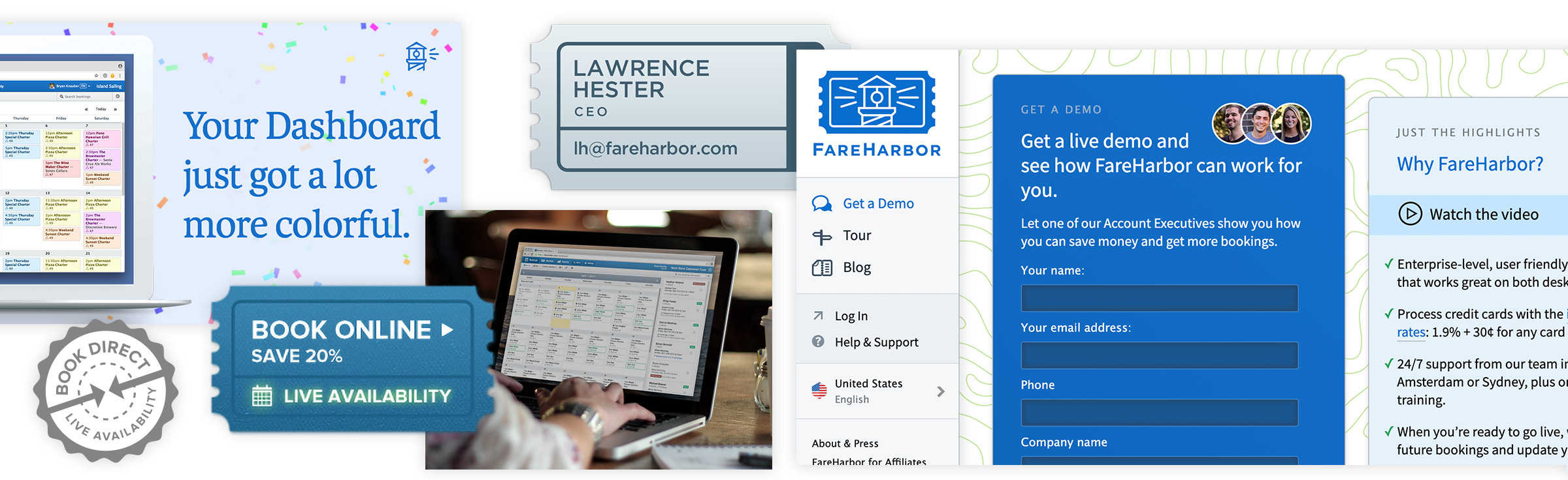
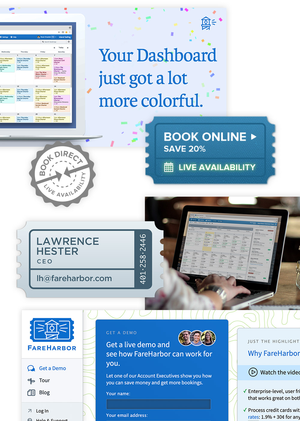
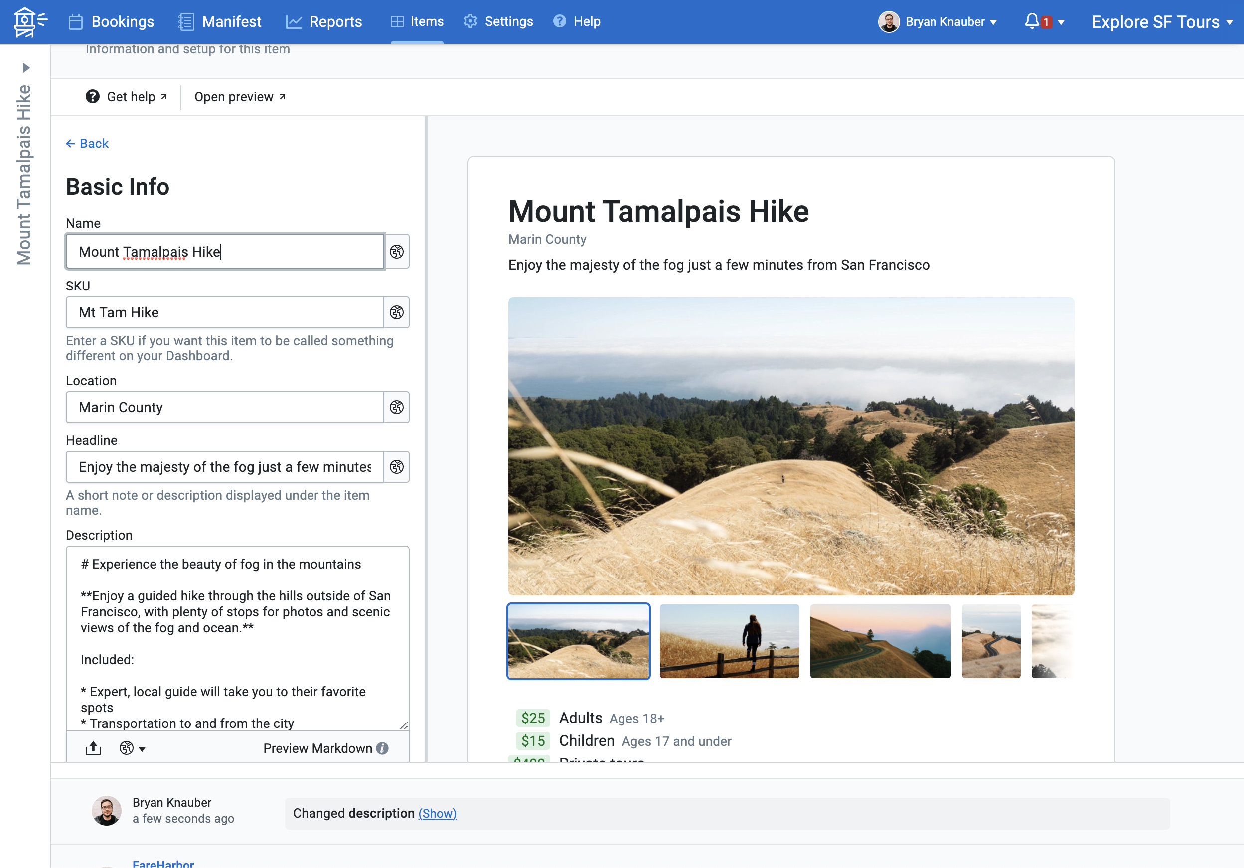
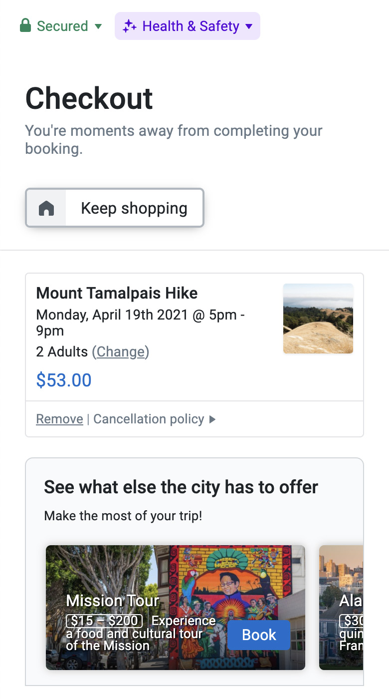
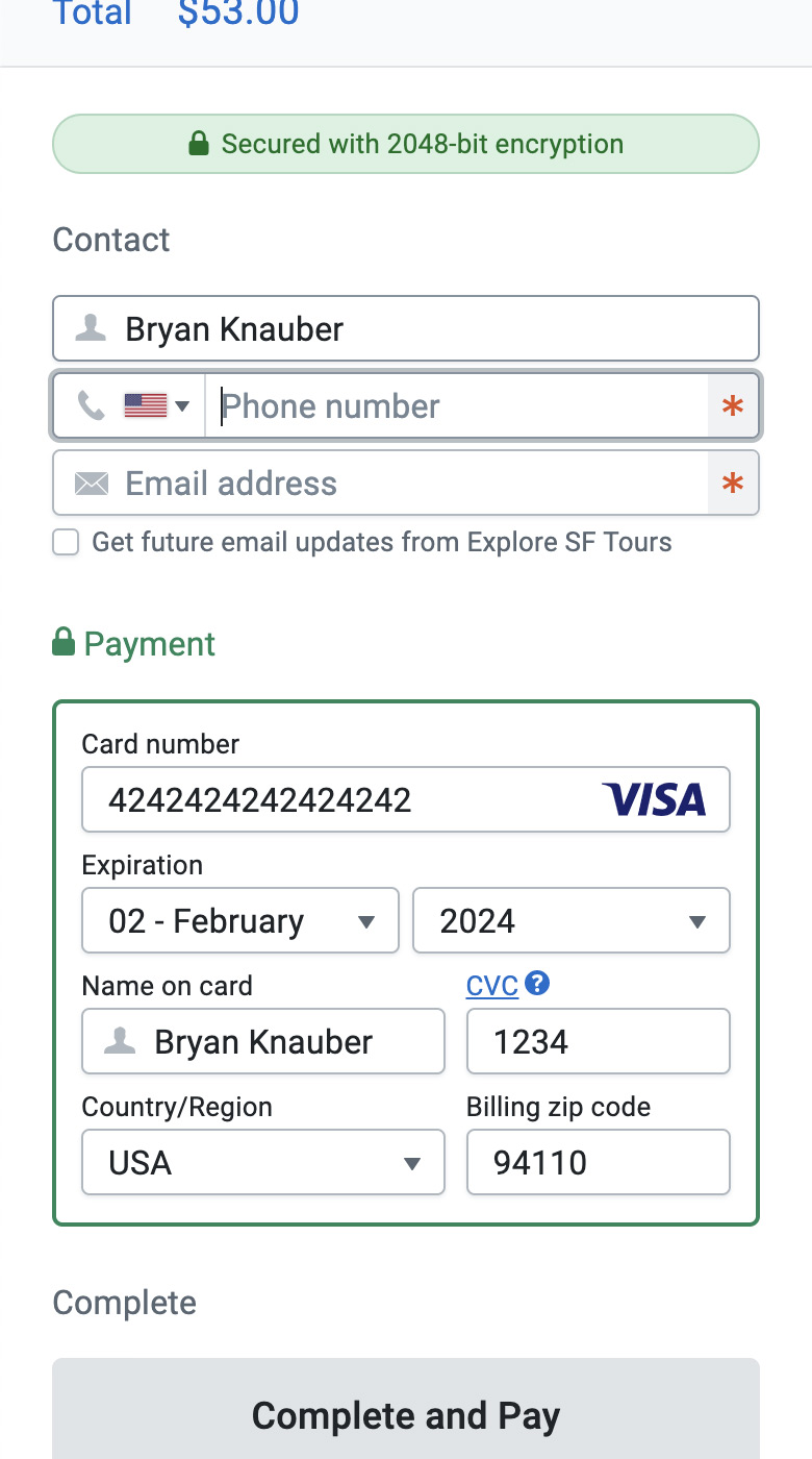
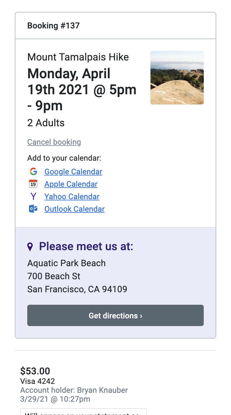
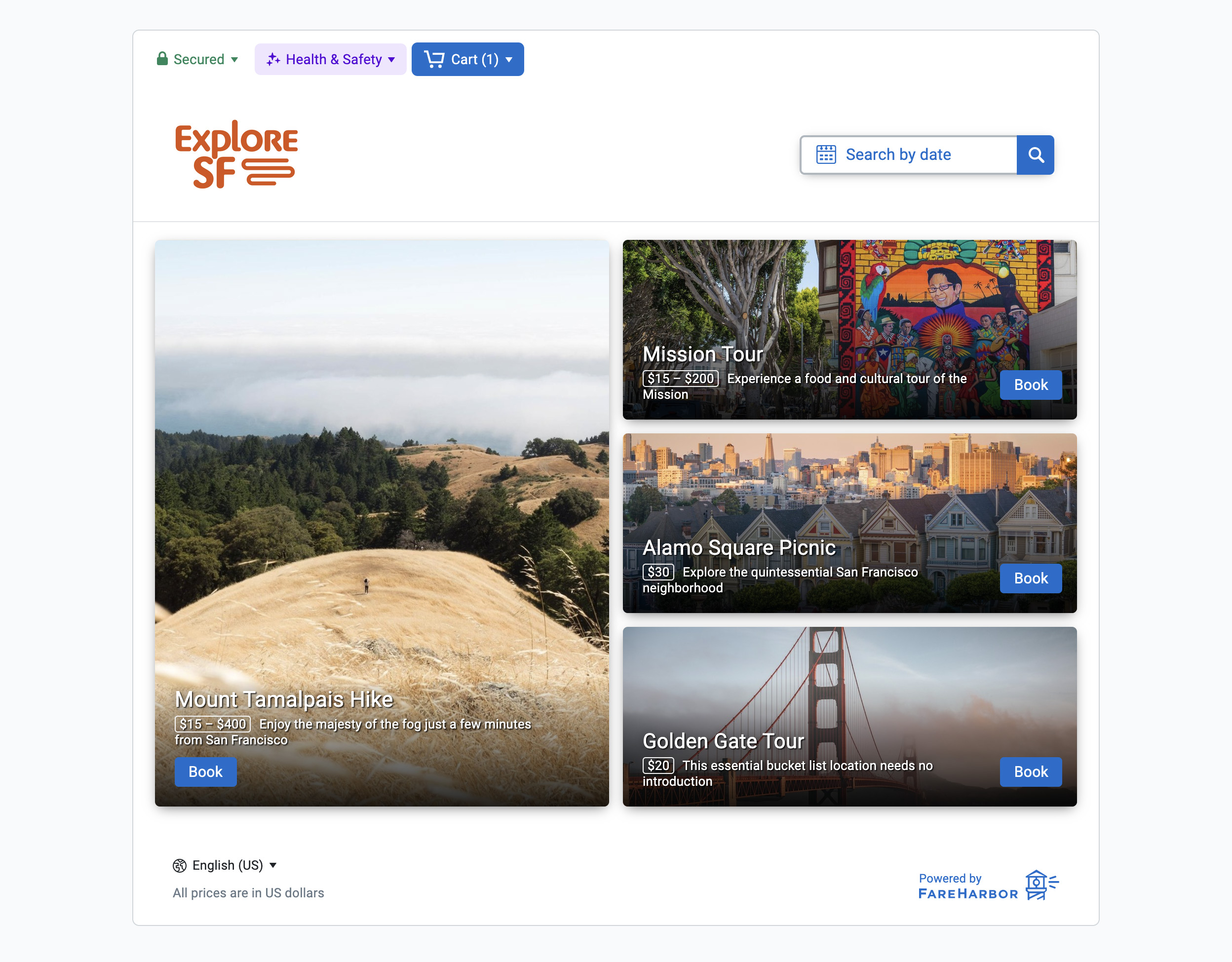
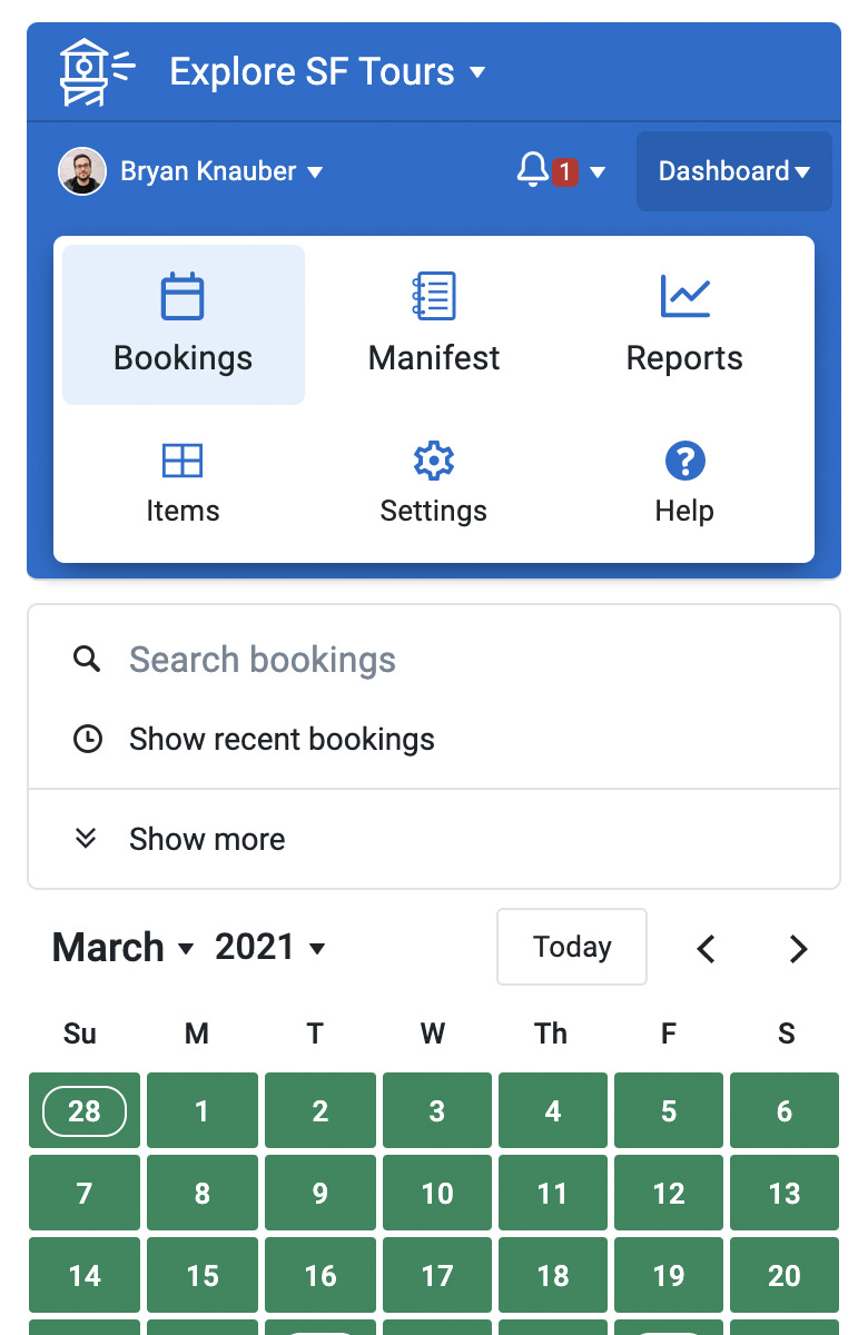
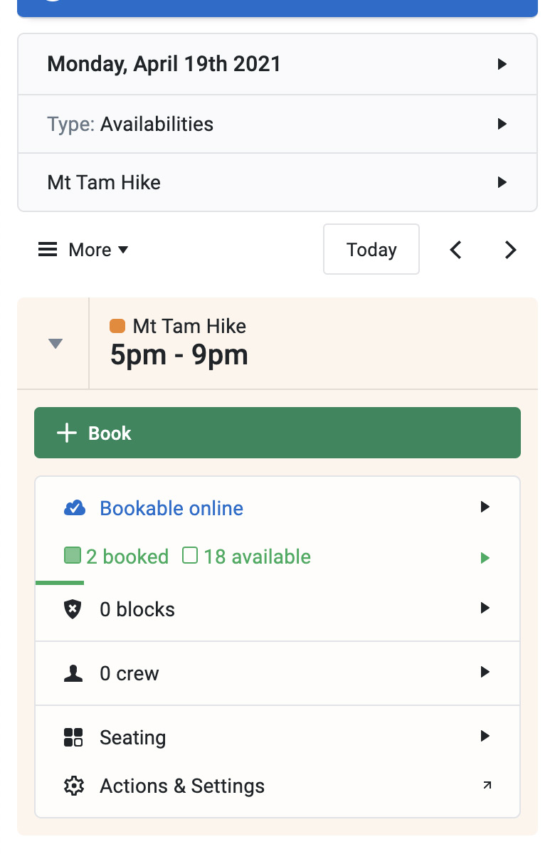
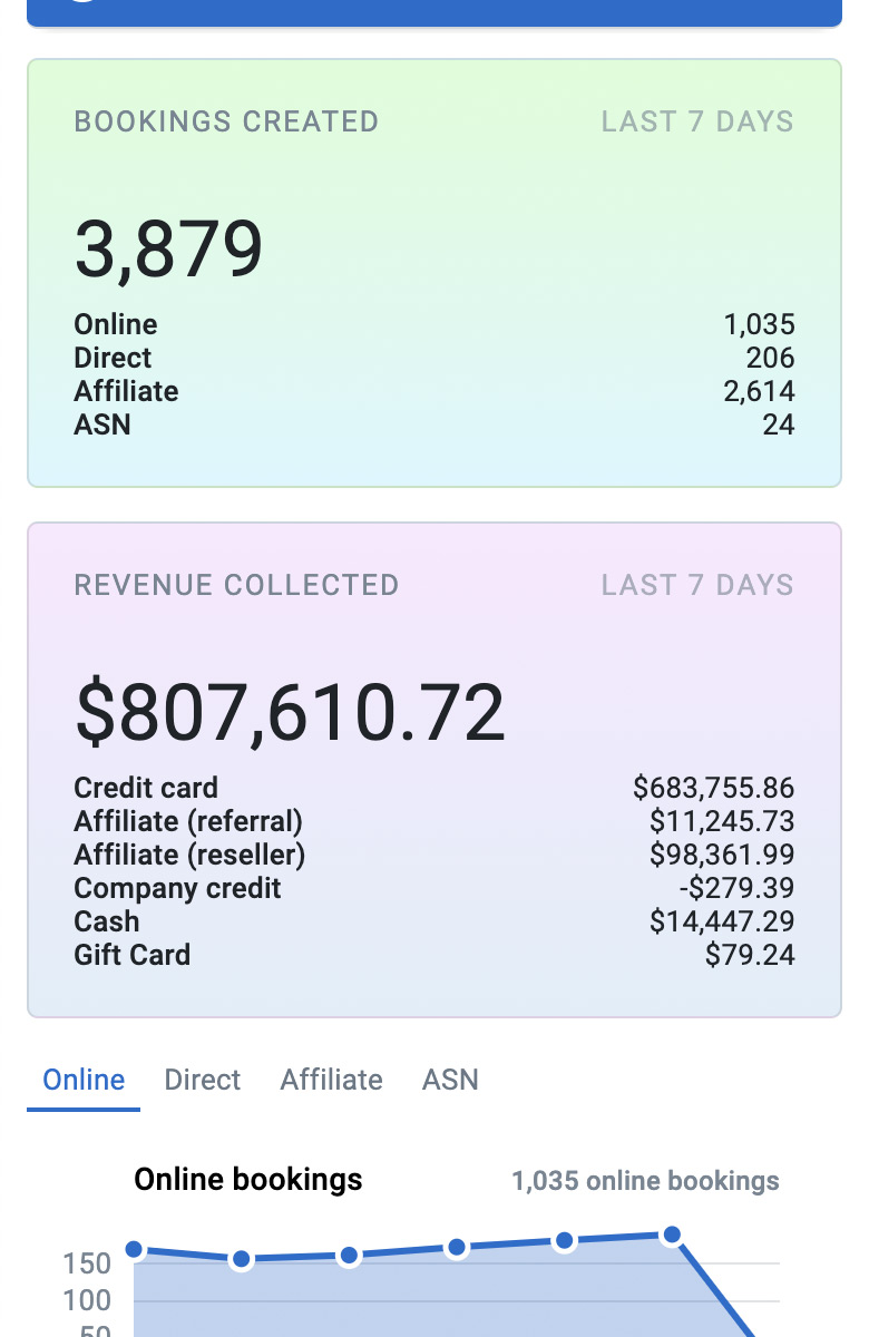
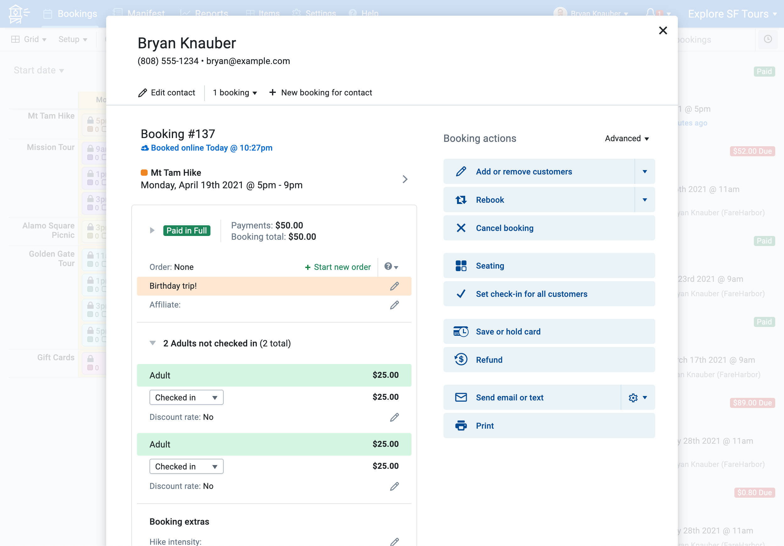
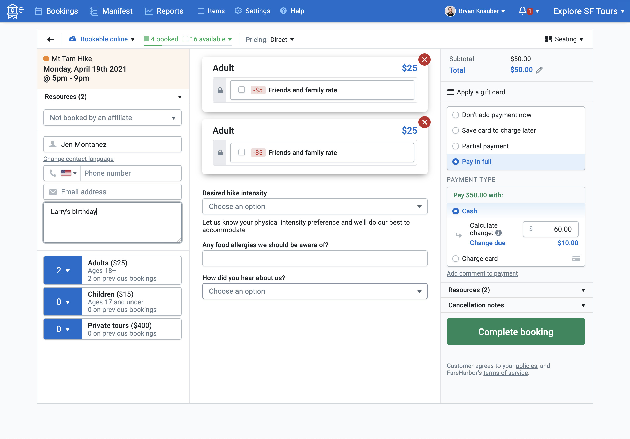
Here are some assorted screenshots of the Dashboard and online booking process as they were in early 2021.
Not just me
Of course, the design I did was just a part of making FareHarbor work. It took a whole incredibly talented, dedicated team giving it their all. From other designers and the Product team, to customer support and sales. I’m thankful to all of them, and still in awe of what we accomplished.
Especially Lawrence and Zachary Hester, who saw the initial opportunity in this space and pushed harder than anyone to get clients, grow the company, and keep the business on track. Besides writing code and inventing data models and accounting structures, Zach Snow and Matt Broten spent countless late nights doing deploys and migrations, and for years were de-facto the ones to get that 2am “stuff is broken” call. Max Valverde and the sales team he built figured out how to pitch FareHarbor and did tens of thousands of phone calls.
There are dozens of others I haven't mentioned by name. But if you’re reading this, thank you from the bottom of my heart.
I’m really proud of what we made, and I hope it keeps on ripping for years to come.
By the way, special thanks to Nikki Collister and Derek Ha for their help proofreading the text of this page. Years of typing the first thing that comes out of my brain into Slack has sort of ruined my ability to write prose.